Year: 2019
School Project: Work in progress
Design by: Anny Follesøy & Matilda Strandberg
The Goal and target group:
The aim of the project was to design an app created for people struggling with anxiety that will make the day easier, calmer and more positive for the user.
We examined apps that already existed and tried to bring out strengths and weaknesses. This is where we figured out how we didn't want our app to work. We found the existing apps being very stressful and demanding, and also focusing mostly on what was wrong with the day instead of bringing positive energy throughout it. We focused mostly on making the notifications themselves less stressful and more comforting. The white semicolon is a sign that symbolizes anxiety.
This project is still in the initial phase, and I'm hoping to continue working on this even further.
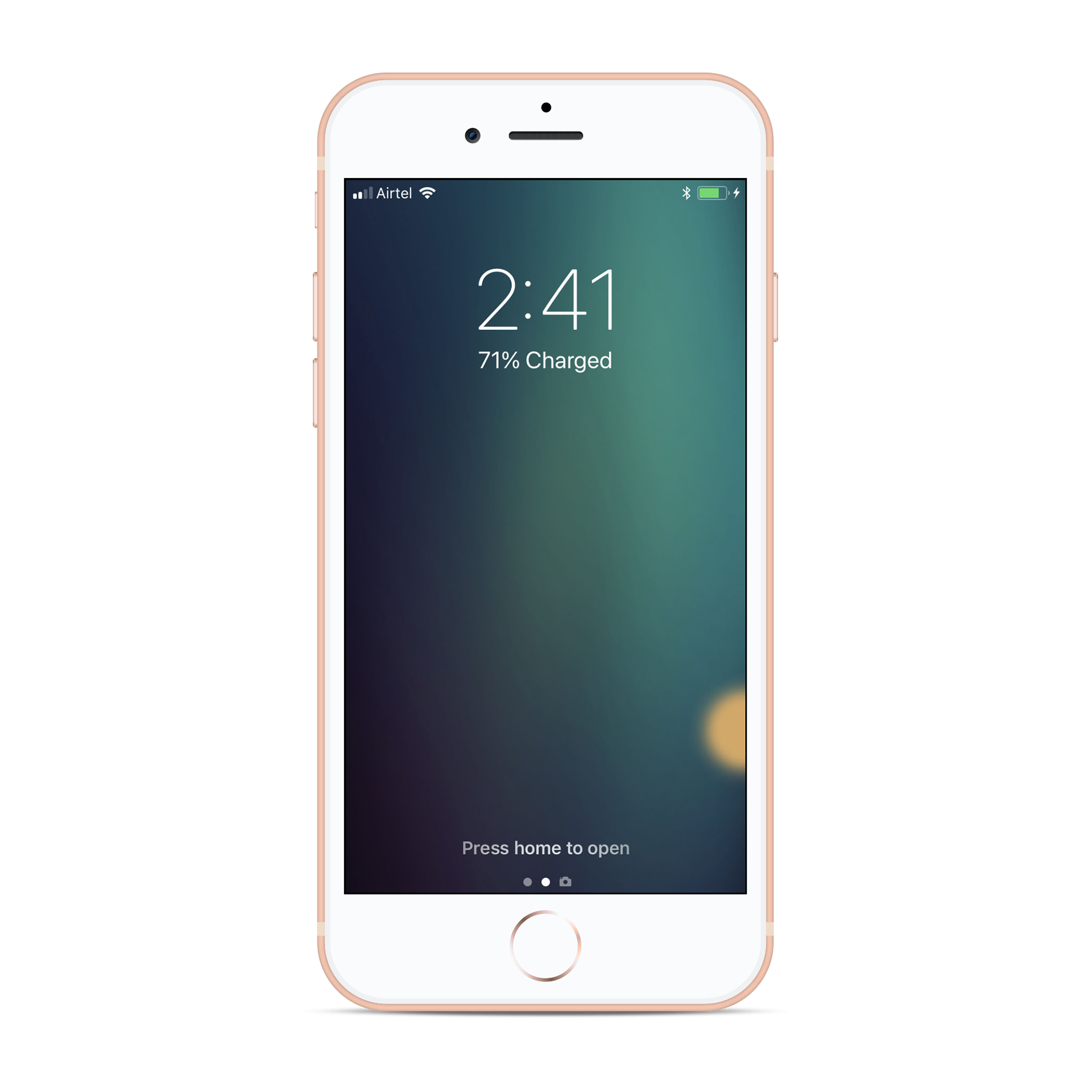
WIREFRAME
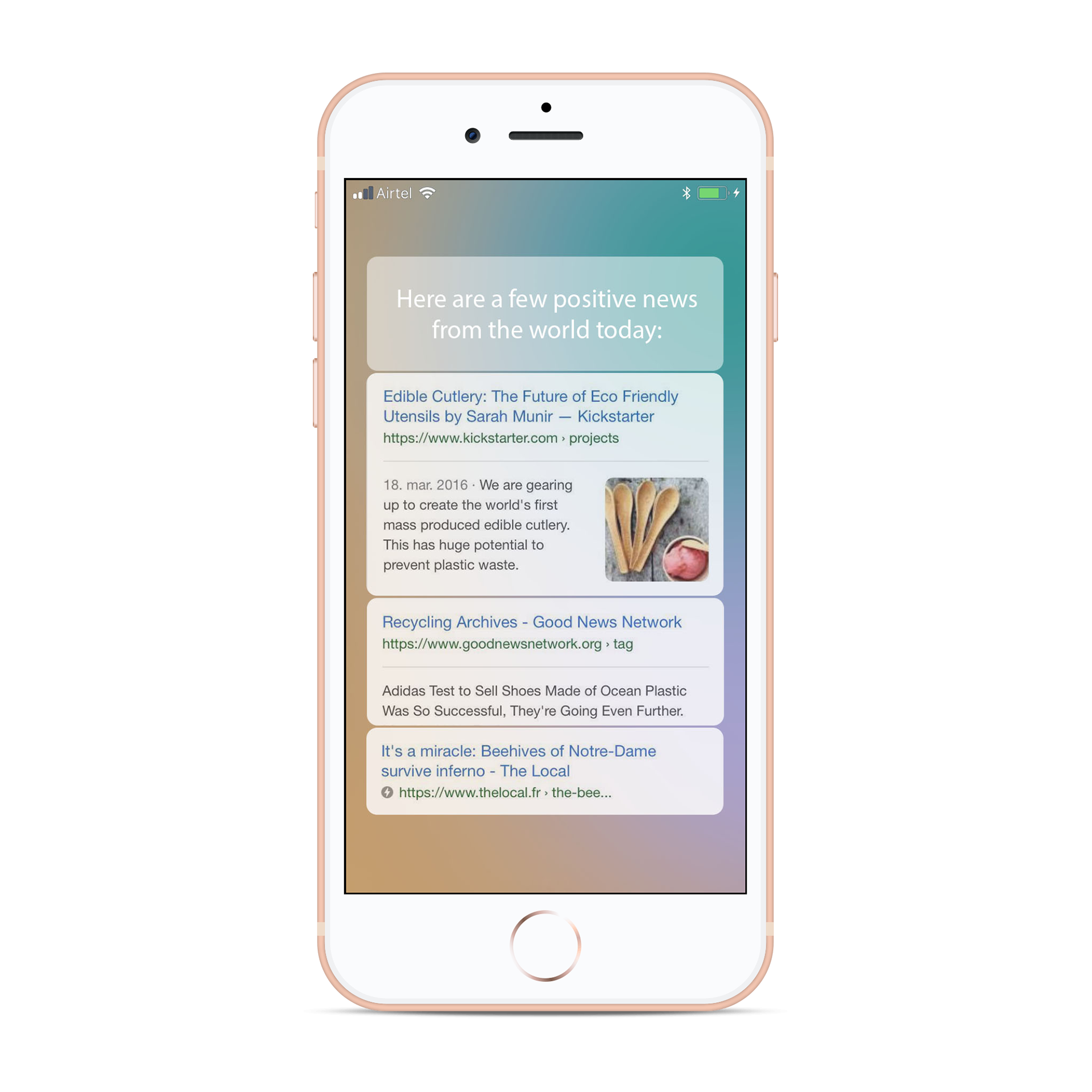
We came up with a solution where the notification quietly appeared like a soft dot in the corner of the phone. If you need it, you can easily swipe it forward, and calm colors fill your screen, followed by pleasant sounds such as waves and wind.
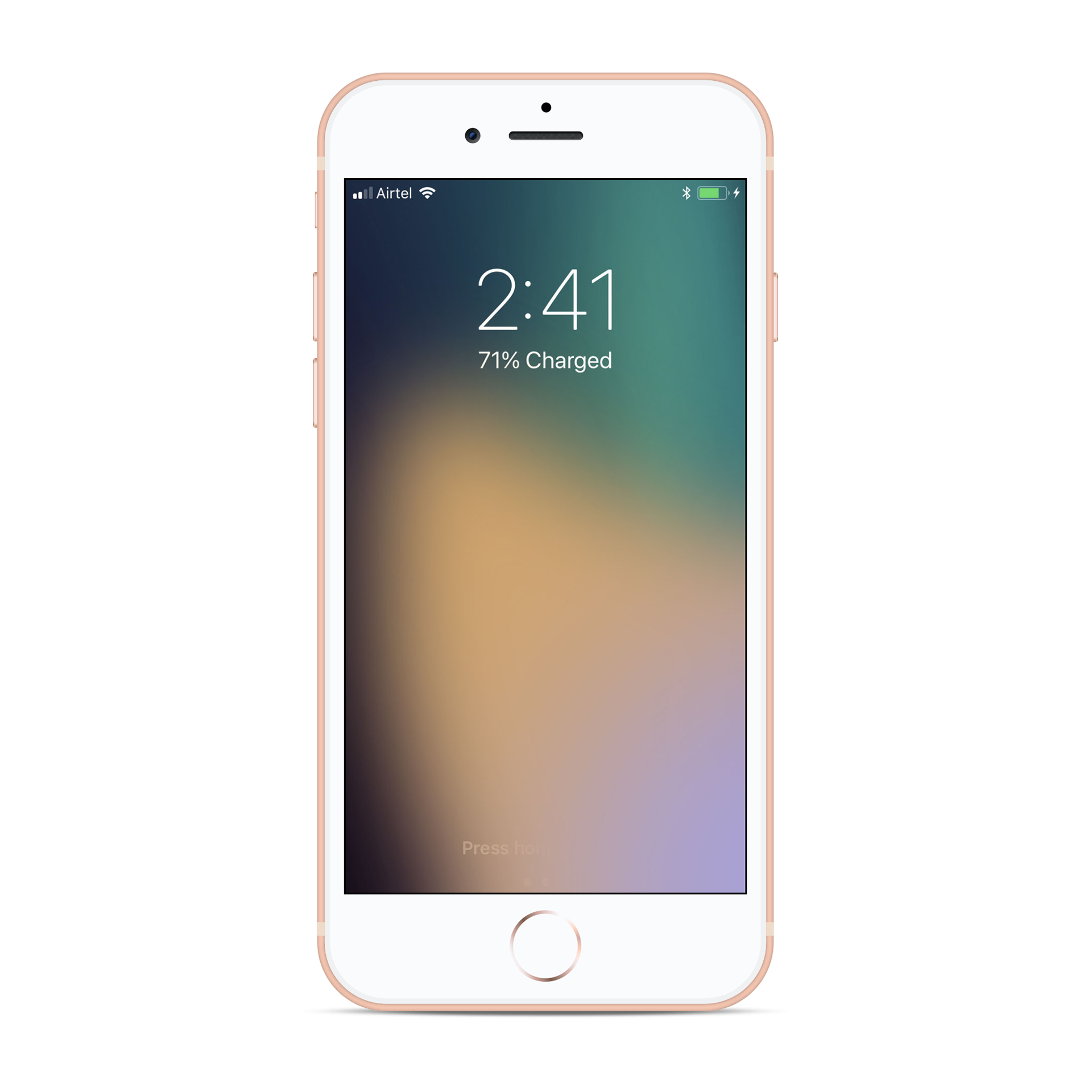
You can easily swipe it away if it doesn't fit. And if you don't touch it, it disappears over time.
You can easily swipe it away if it doesn't fit. And if you don't touch it, it disappears over time.
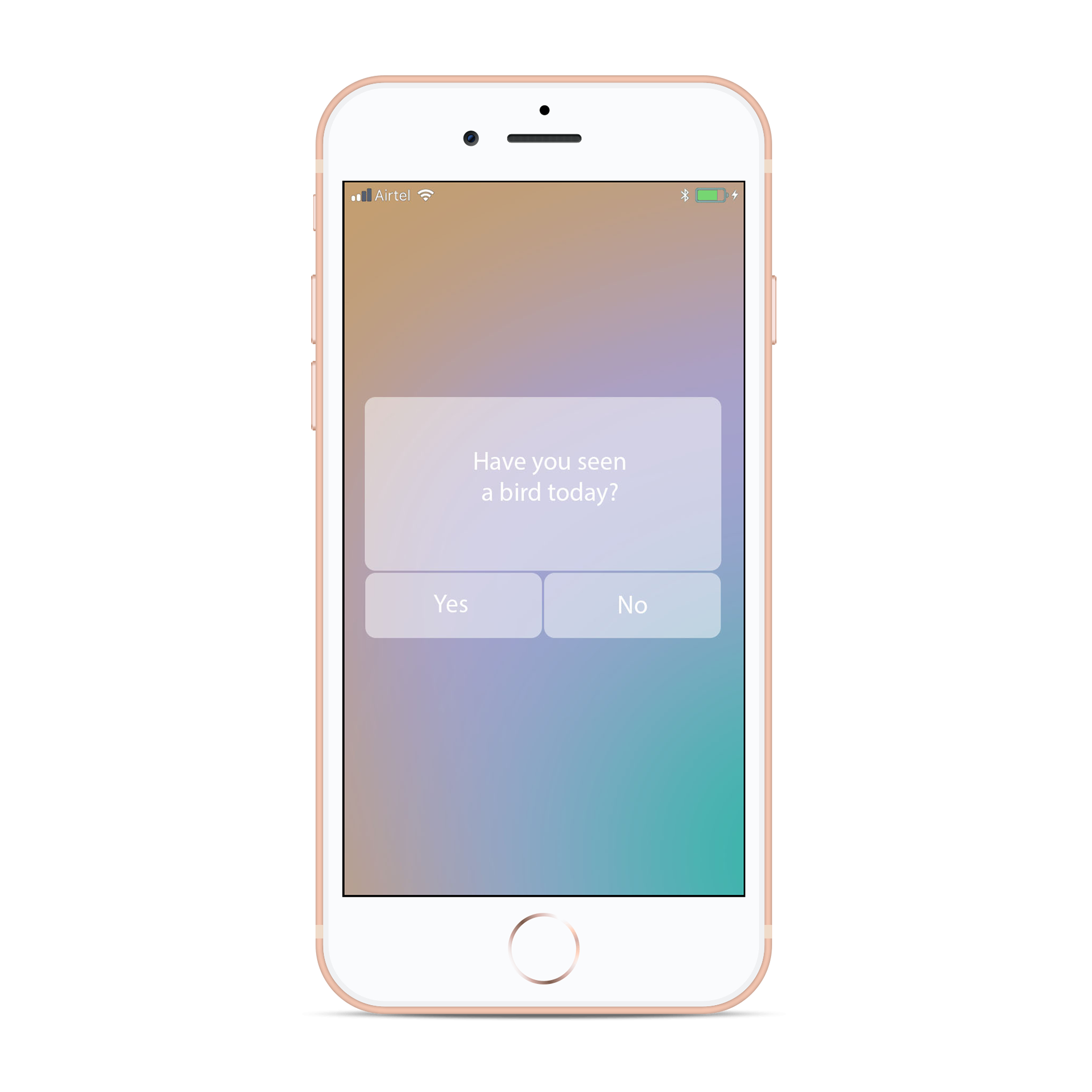
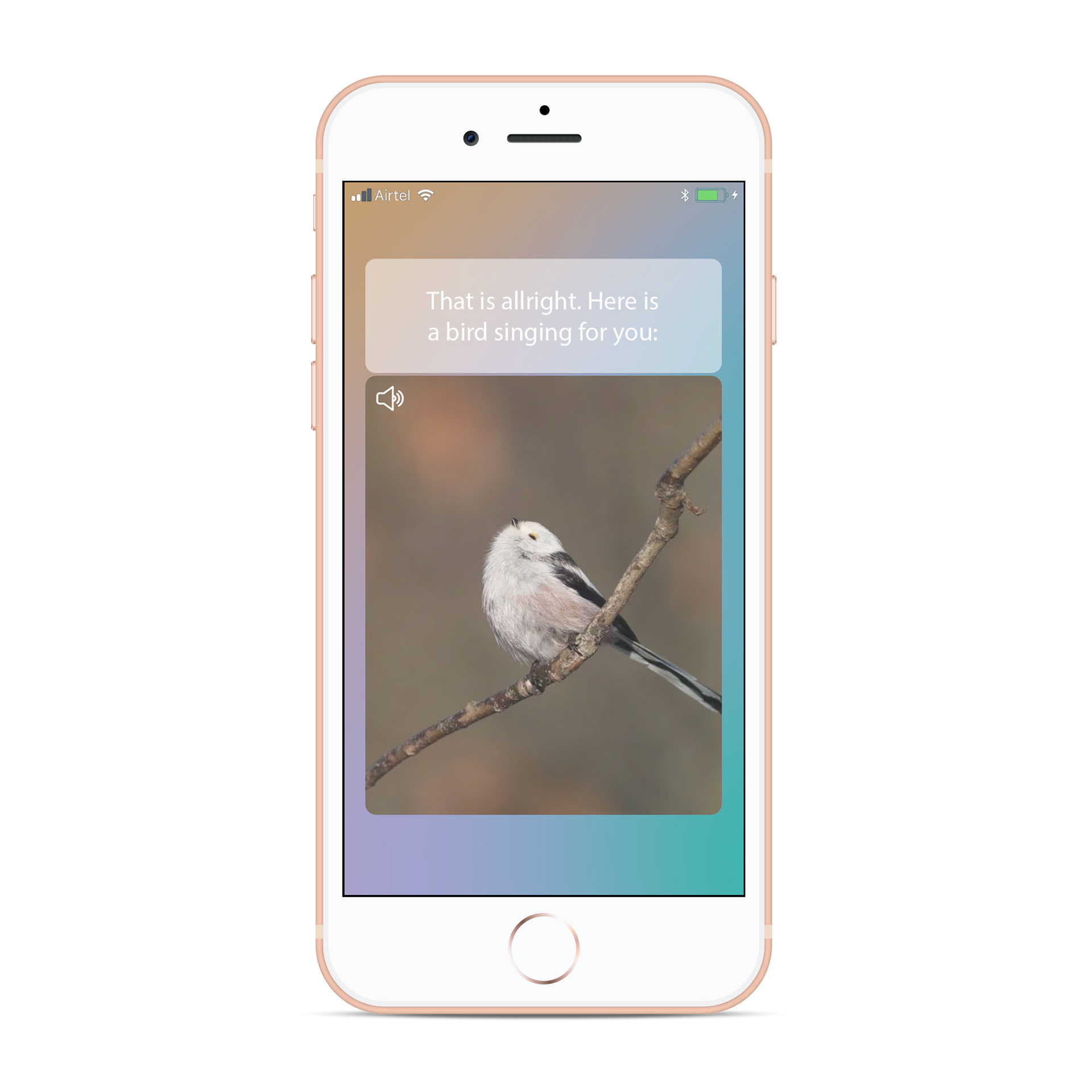
It will ask you questions about how you feel and give you opportunities to do something nice for yourself. It focuses on the positive things that is happening in the the world and gives you good news instead of focusing on everything that goes wrong.